Project Background
As a UX Designer Co-op on the Zipcar UX Design team, one of my two projects was to lead the localization of the London Presales' design system to that of North America's. London is the primary and largest market for Zipcar Flex, a popular feature that allows customers to book Zipcars for one-way trips throughout the UK.
It was an incredible experience working closely with a global team of stakeholders to hit one primary business Objective and Key Results (OKRs). The impact of my design decisions allows top feature Zipcar Flex to stay competitive in the market, and increase conversion rates to the business registration funnel.
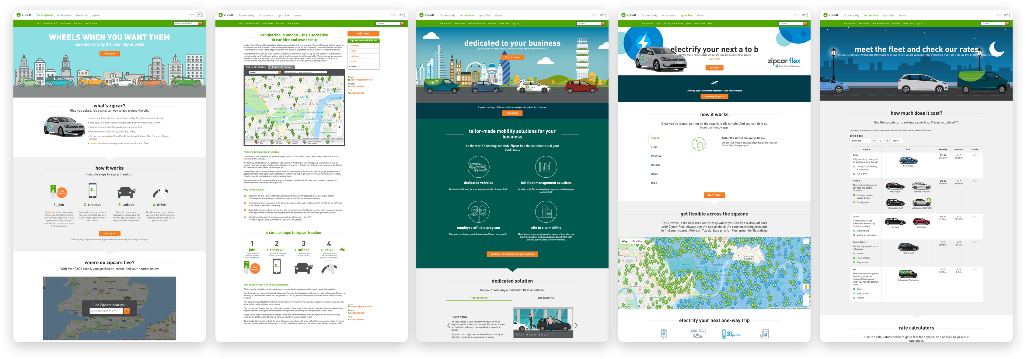
Original desktop screenshots of UK Presales 2018 (left to right: Consumer Home, Value Prop, Zipcar for Business, Electric Vehicles, Pricing)
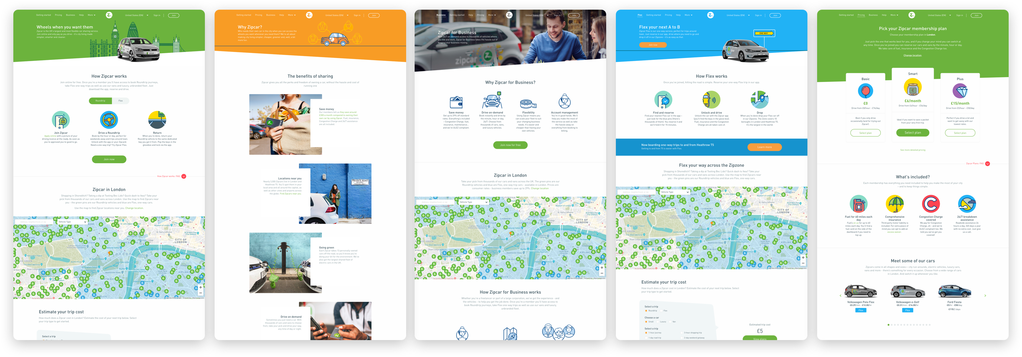
New desktop screenshots of UK Presales 2019 (left to right: Consumer Home, Value Prop, Zipcar for Business, Electric Vehicles, Pricing)
The Problem: Why a Redesign?
Zipcar identified that sign-up registrations in the UK was in decline and did not meet the previous quarter's expected business OKRs, despite the rollout of new UK-specific products: Zipcar Flex and Zipcar Roundtrip.
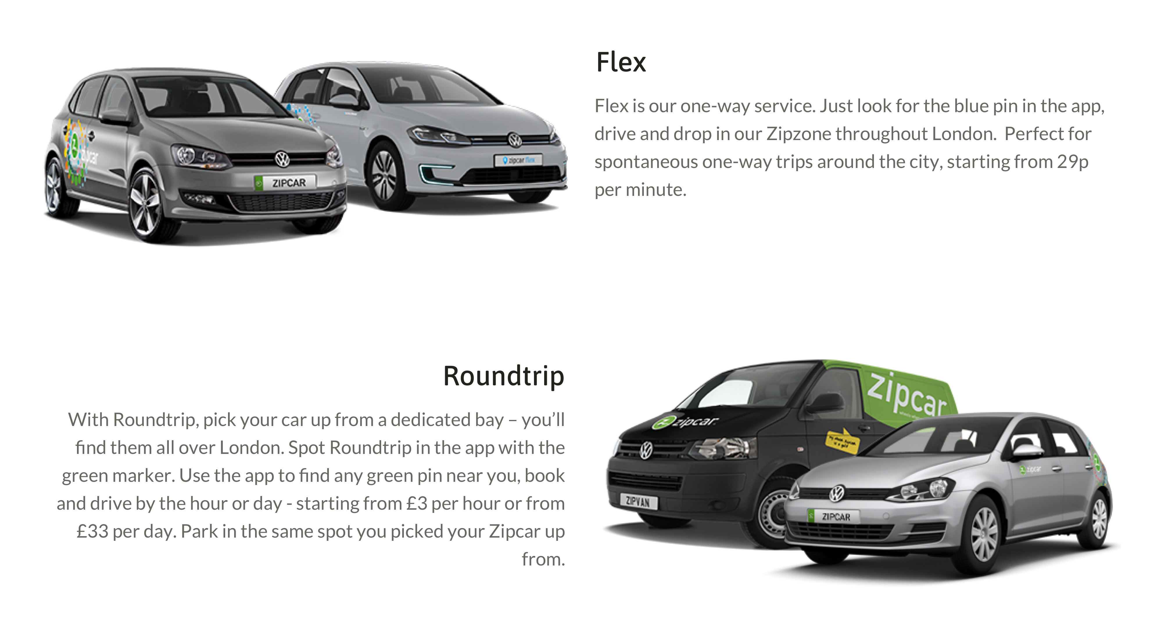
A description of Zipcar Flex and Zipcar Roundtrip.
Zipcar was one of the first companies to break into the carsharing industry 20 years ago. Our products are innovative and distinct from UK competitors like Turo, Car2Go, and Getaround. But, our main registration funnel, the Presales site, showcases outdated web design—this insinuates a feeling of distrust and unreliability, and even whether the company "exists at all," as discovered in initial user interviews.
How might we drive the business with human-centered design, as opposed to a product-driven one? As the modern-day carsharing market grows increasingly competitive in the UK, how might we stay relevant and still uphold the same reliable, future-forward, and community-driven service to our consumers?
Zipcar's brand refresh
Zipcar's Marketing Team and Design Team were also rebranding the style guide at this time. Because I was working on the flagship site for a large market, I was in the loop for new branding updates and brought them back into my localization project. In this case study, I'll be listing the design thinking behind a few complex design system components.
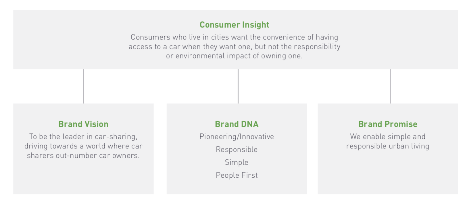
Zipcar's 2019 brand positioning, straight from their external style guide.
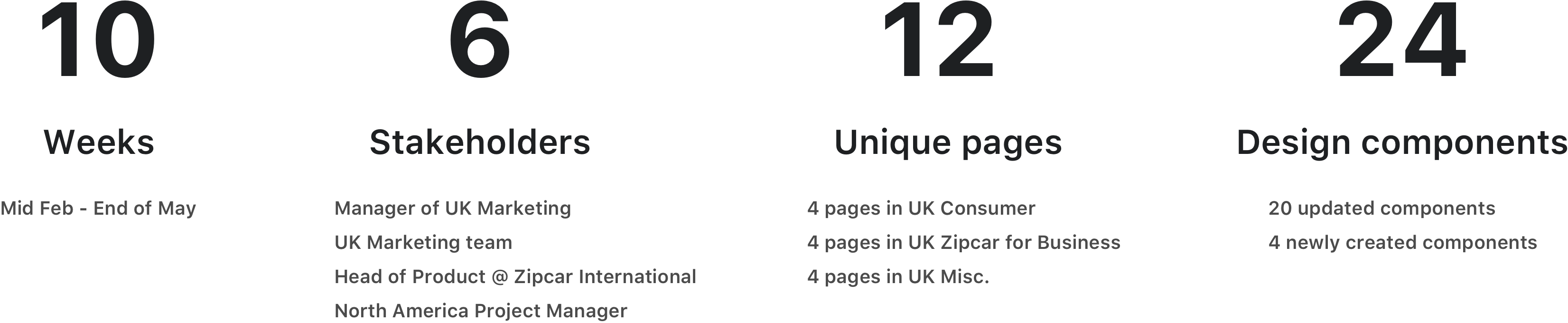
My Team
Designer
UX Researcher
North America Product Manager
Head of Product @ Zipcar International
Manager of UK Marketing
UK and North America Marketing Team
Project Scope
Icons and Illustrations: Flatline or Circular?
Iconography is crucial to Zipcar's branding. Zipcar has distinct pages for two audiences: Consumers and Businesses. For Consumer pages, the brand voice relies on the playfulness and authenticity of icons and illustrations to visually convey messages and values. Through many icon explorations, the US Marketing Team and UX Design Team chose to transition to colorful circular icons. Containing illustrations in circles, detailing the same border width, and referencing the style guide's color palette contributed to visual consistency throughout the Consumer pages.
A compilation of my Consumer icon designs, which are featured on the UK site.
On the other hand, Business pages also leverage photography for a more professional audience of enterprise admins. While we could have just toned down the bold colors on the circular icons, we ultimately decided on using flatline icons with muted colors because it kept some visual familiarity for an older audience who have been longtime Zipcar users. It also feels visually closer to the element of photography and movement on the page.
A compilation of my Zipcar for Business icon designs, which are featured on the UK site.
These icons I designed will be reflected in future Zipcar platforms and products, such as on the membership site, mobile app, and communication emails.
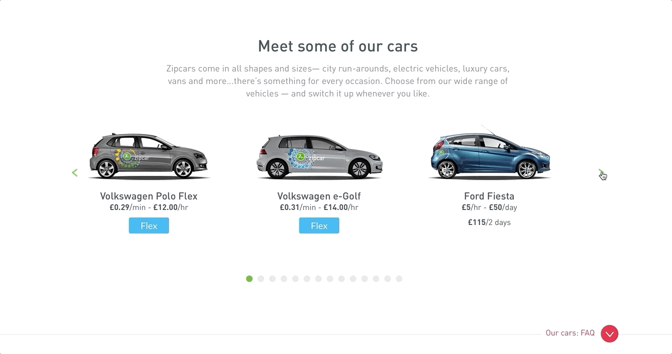
Car Carousel
The Car Carousel is one of the most interacted components on the Presales site, making it an extremely valuable affordance for the business. Due to the flexible application of the component's information, there are multiple touchpoints to access this carousel: Consumer Home, Pricing, and Zipcar Flex.
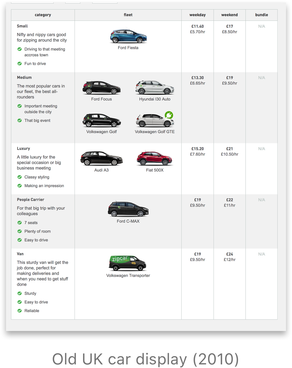
The previous design featured cars and pricing in a table, taking up a lot of vertical screen real estate. While the table-view was a one-stop shop to all types of cars (i.e. Small, Luxury, Vans) and highlighted pricing, the business value has since then shifted emphasis to Round-trip vs. Flex cars, and aesthetic comfort over cost.
A carousel invites fun user interaction, allows for easy visual scanning, and minimizes information overload.
Although my task was to localize, or update components, from the UK site to North America's, there were some visual elements I improved upon the existing carousel.
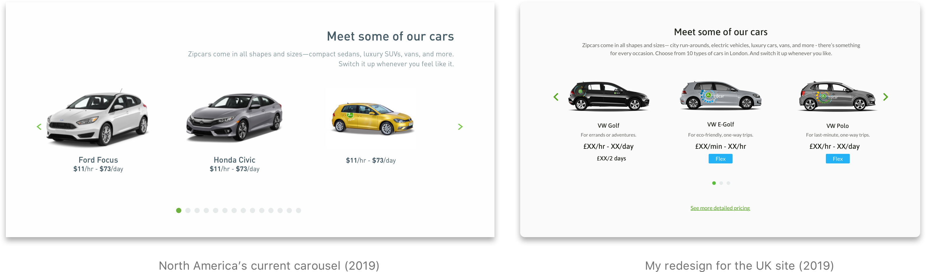
I wanted to build upon the structure of the current North America's carousel (left) in my redesign (right). In the redesign, the content feels more centered and grounded on the page by centering the heading and description, as well as minimizing the white space between the right carousel arrow and the car.
North America's carousel also draws attention to the varying car sizes and angles. Zipcar's brand refresh was "move forward and futuristic," so I worked with the UK Marketing Team to supply right-facing Avis car model images, adding to the overall visual consistency as well as highlighting the unique colorful branding of Round-trip and Flex cars.
Working with the UK market also meant familiarizing myself with their region-specific pricings, like how Round-trip in the UK offers 2-day pricing and how Zipcar Flex only exists in the UK. I modified the North America Car Carousel to include these business market needs with a second line of 2-day pricing or a blue Flex tag.
Cost Calculator
Based on positive engagement metrics with the Cost Calculator on the North America site, we brought the feature over to the UK site.
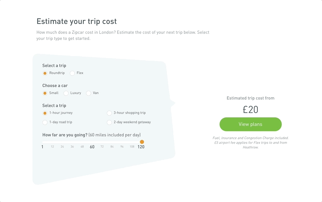
The cost calculator is a feature for users to estimate cost for an ideal Zipcar trip.
Working with my PM and Head of UK Marketing, we wanted to offer estimated pricing for an errand-specific Round Trip or a time-based Flex VW Electric-Golf car. I explored different information across specific selected states. One example of an iteration for Flex VW Electric-Golf was to use the slider for selecting time rather than milage, since pricing was only time-dependent.
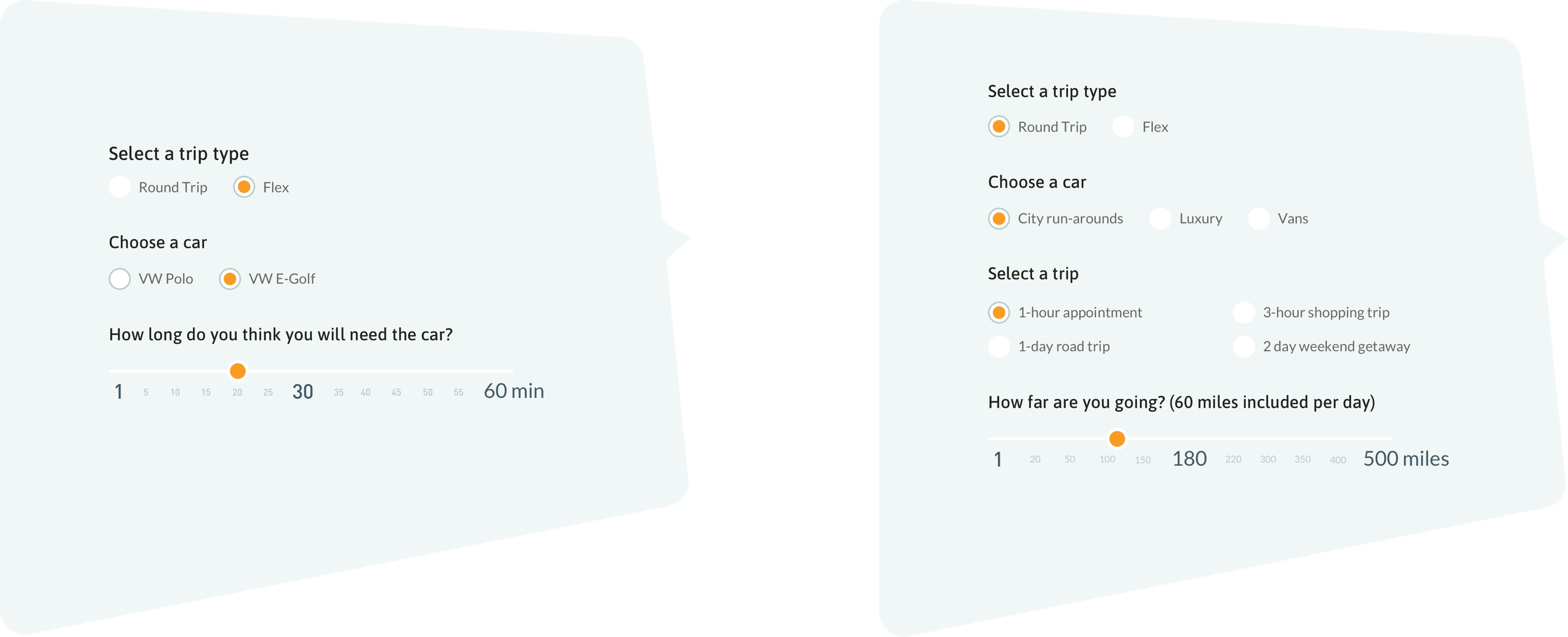
One of the iterations for designing different states between Flex and Round-trip selection.
But due to technical constraints, we realized later on that we could not engineer away the "Select a trip" section, which was already time-dependent. On top of that, the purpose change of the slider offers a completely different user experience, which may frustate users who want to calculate pricing based on how many miles they know they will be traveling. This was a case where design impacted the business to re-evaluate their pricing model.
Geographic Map
The map is one of the final interactive components on the site. In the previous UK site, the map showed a more prominent blue overlay for the Flex zone and displayed all Zipcars as standard location pins.
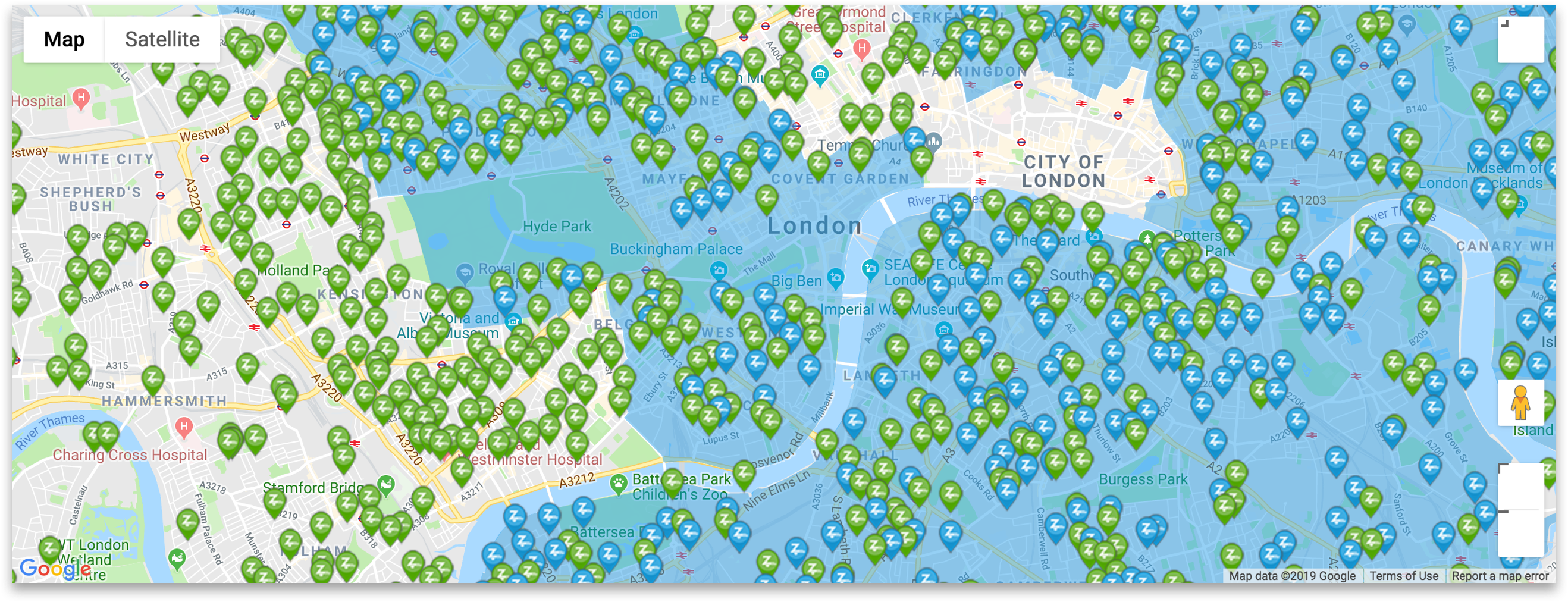
The previous design of the map. Note the dark blue Flex zone and car pins.
My feedback to my PM was that the blue overlay was too heavy on the map, almost like the city "was underwater"—I also noticed that it caused visible accessibility issues with the blue Flex pins and River Thames. I submitted a ticket for the engineers to reduce the opacity by 70%, which has been successfully developed. To further increase visibility of pins, I redesigned them to show only the pin heads; the selected state will feature a larger pin with the pin needle to differentiate itself.
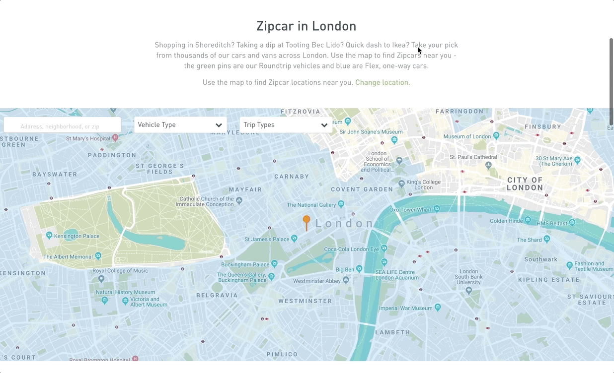
The redesign of the map, now live on the site. The blue Flex zone is 70% more transparent than the original, and car pins have been simplified to just the pin head.
Other Components
During this project, I redesigned 20 atomic design components and created 4 new ones. Here are a few samples of the other system designs.

Some of the other components I designed! These are reusable throughout the site.
Feedback System
I worked incredibly closely with my PM, US Marketing, and the UK Marketing Team to design and successfully deploy a completely new website in a 10-week design sprint and 8-week engineering sprint. I had in-person meetings with the PM twice a week and weekly remote calls with the UK stakeholders, where we reviewed weekly progress across 12 Consumer and Business pages. There were many synchronous tasks each week, including but not limited to UX copy and photography handoff, icon reiterations, and atomic design updates. We used a shared spreadsheet to document progress and over 200 tasks for the Designer, PM, and Marketing Team.
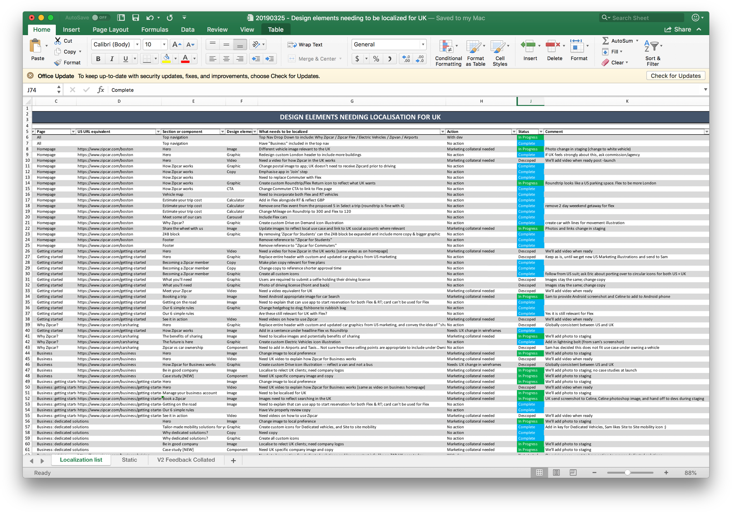
Using a shared Excel document as our "dev-ops" to track progress
As the main designer driving the design decisions of this project, I was responsible for delivering updated Sketch artboards to Zeplin and checking-off delegated tasks on Jira. The senior designers on the UX Design Team were very supportive by sitting in on early team meetings to help with my onboarding to the big project, and often provided feedback on my design iterations!
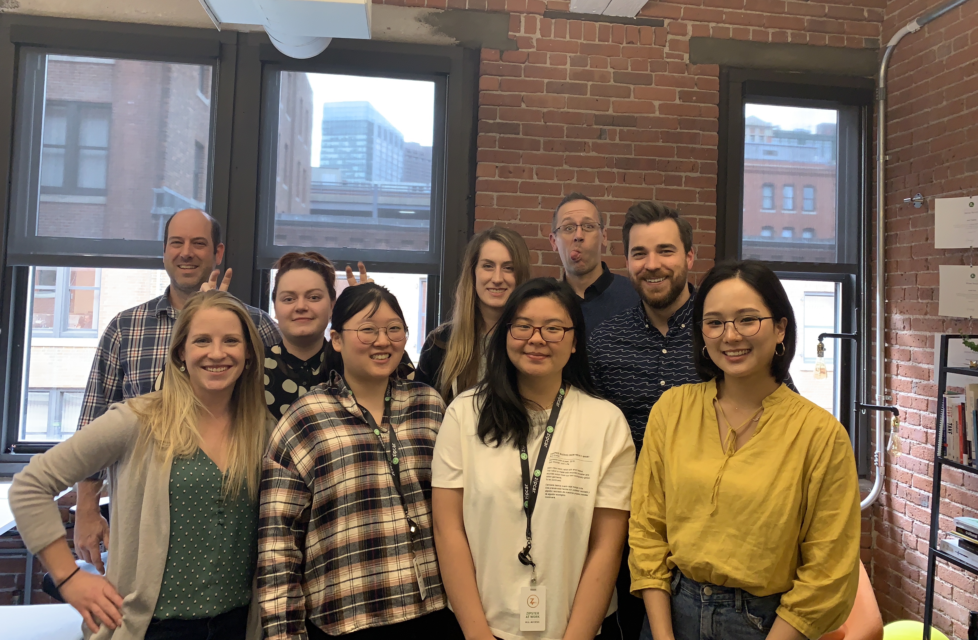
My Zipcar UX Team and I (wearing the white shirt in the first row) :) I was the sole UX Designer co-op in Spring 2019!
Learning about Conversion Rate Optimization (CRO) and A/B Testing
At the end of this project, I dabbled in learning more about CROs, success metrics, A/B testing, Optimizely, Google Analytics, and Hotjar to improve the user registration rates through the registration funnel. I handed off A/B designs for an upcoming A/B test.
Conclusion and Final Reflection
It was an amazing learning experience to design for the UK market, and I'm grateful for my UX Design team in trusting me with such a global project. Working directly with stakeholders and the Head of UK Marketing taught me the direct correlation between user design and successful metrics. Communicating with my PM, backend, and frontend engineers guided me in creating optimized designs that were technically feasible to develop. It's still surreal for me to see my journey, growth, and hard work on the updated site!
Feel free to view the new UK Zipcar site at https://www.zipcar.com/en-gb!