Background
The Massachusetts Bay Transporation Authority (MBTA) is the oldest form of public transportation that connects Boston and Cambridge. With increasing modernization in developing cities all over the world, the MBTA lacks the modern subway station technology, like in London and Beijing. As a part of freshman course Design Process Context & Systems, we analyzed some of the outdated and unndesirable traits of the MBTA, and brainstormed ways in how we might tackle these issues with better design choices.
Experience Mapping
Before we dove into the specific issues with the MBTA system, we each documented our experience riding the T with experience mapping to gather data and keep track of user journey.
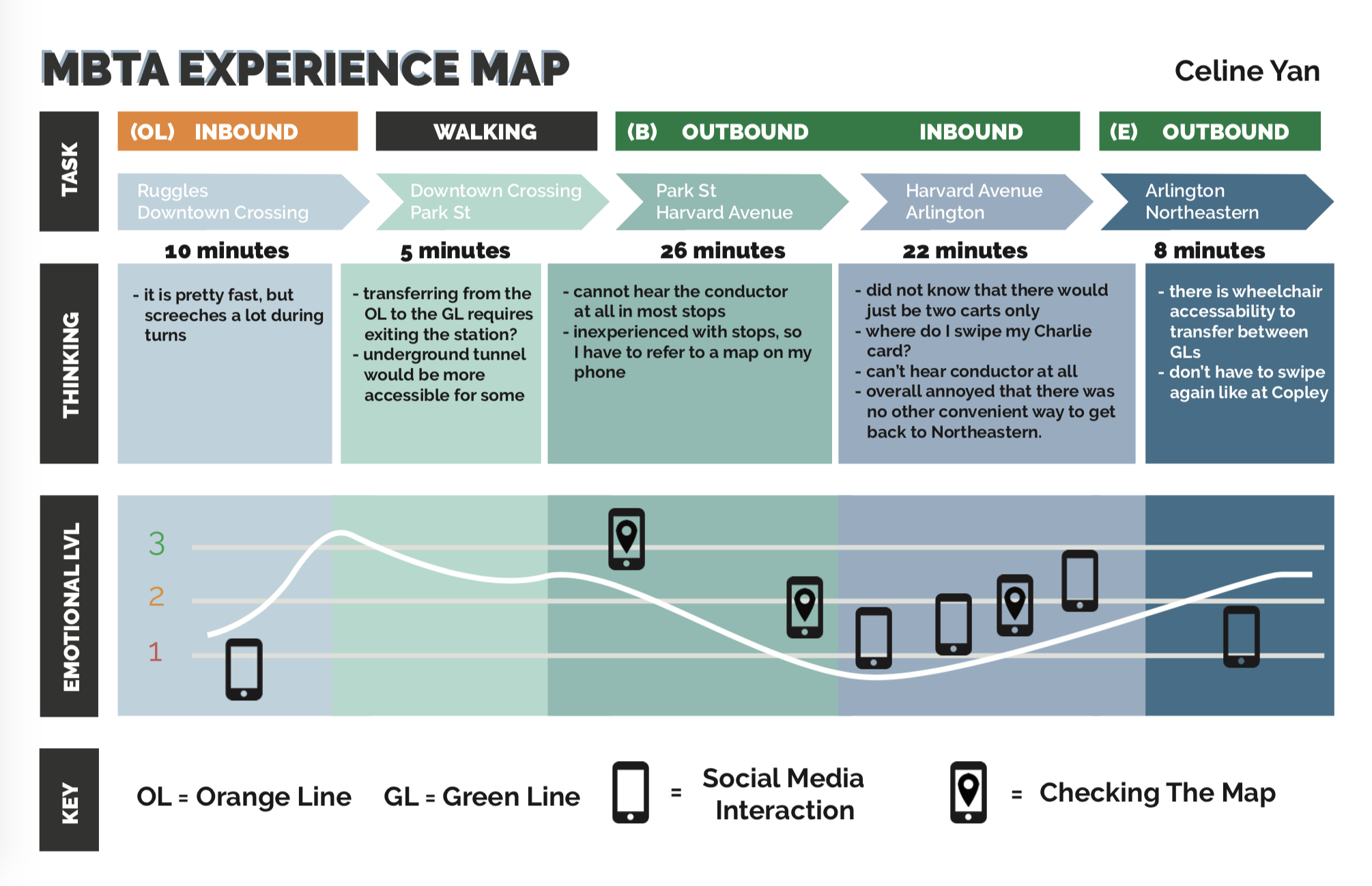
I maintained a simple chart displaying my mood and highlighted issues that hindered my experience. Factors such as incredibly loud screeching of the wheels (much louder compared to New York City's MTA subways), lack of signage, and duration of time between the B and E Green lines contributed to frustration with the system. I was also counting the number of times I used my phone, noting whether it was due to confusion in directions or simply out of boredom.
Affinity Mapping
We put together our biggest issues with the MBTA by grouping post-its on the whiteboard, such as signage problems, lack of accessibility, and even unwelcoming features of the T stations.
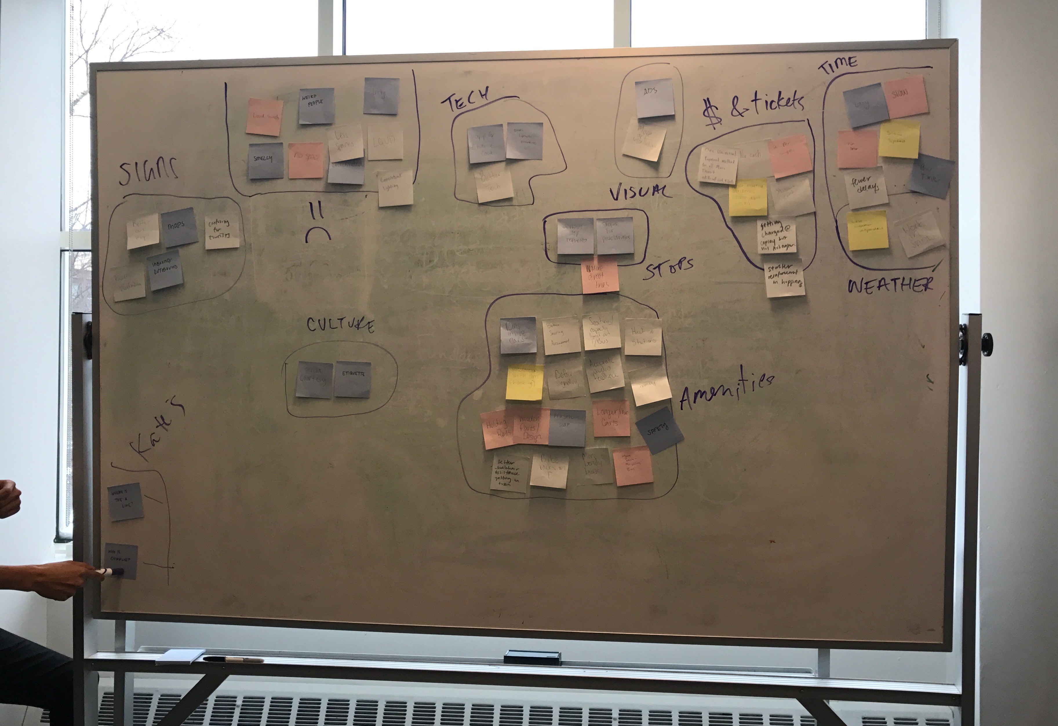
Categorizing groups of different proponents in a MBTA riding experience.
After the brainstorming session, we discovered the many potential improvements for a regular T passenger's commuting experience, given better design choices and creative thinking.
Product Development
I tackled the MBTA's "unwelcoming" features, and designed a way to integrate visual art into the stations. Since the T is popular among commuters, it's important for local businesses and neighborhoods to leverage the business flow from nearby T stations. This ties into the role Boston plays as a college town and as a tourist heavy city; physically, most old T stations seem unkempt and unclean, detracting the largest potential population to utilize the T: college students and tourists. In order to tackle this issue, I looked more into the Art Guideline initiatives by the MBTA, which currently includes physical structures and art murals. By implementing art pieces into physical space, the MBTA hopes to promote community value while implementing fresh features to various T stations.
Why AR?
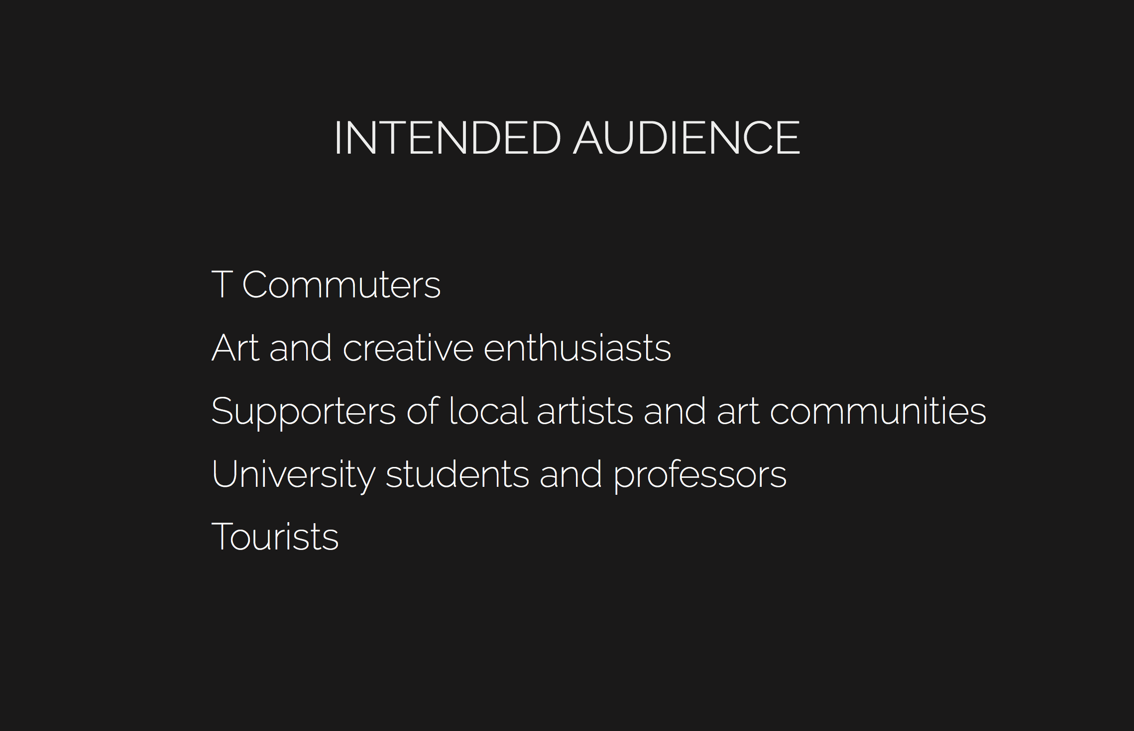
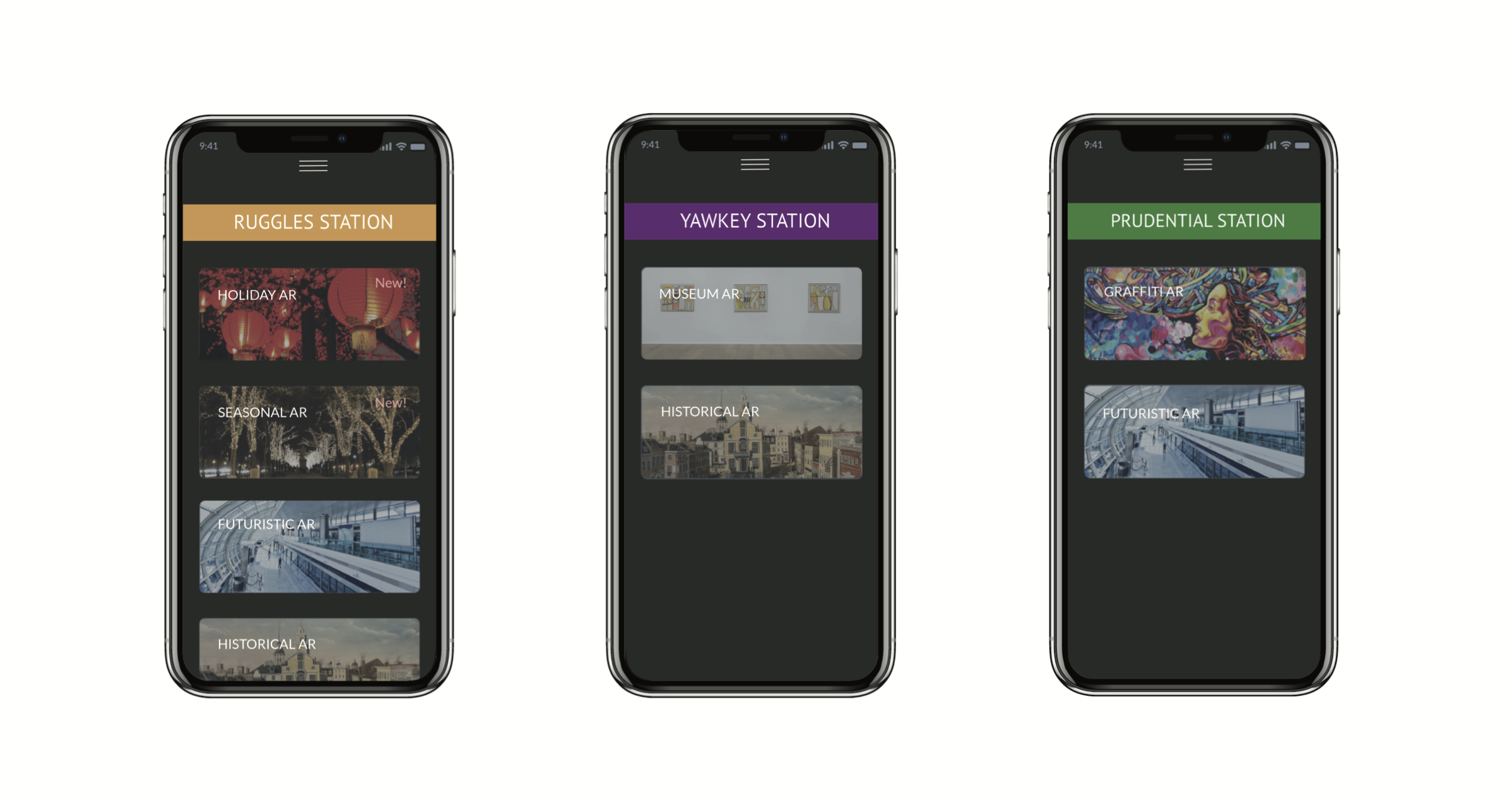
Virtual art is a growing medium, as recently seen in Snapchat and Facebook Messenger, and AR is a viable solution for the outdated MBTA to utilize new technology. Tourists and colslege students most likely own smartphones, so AR is easy to access through an app and act as a passive, interactive medium. The primary idea is to promote local artists, art communities, and art museums in an initiative to integrate desirable, virtual technological art exhibits in viable T stations. These exhibits may be temporary, time-wise dependant on which category it falls in:

Sketches, Wireframing, & Prototyping
I focused on the AR on the T mobile app experience, keeping two major questions in mind:
"How can we implement more modern works of art and design with the increasing engagement with technnology?"
"Ultimately, how can we deliver a more enjoyable and appealing experience for technologically adept customers?"
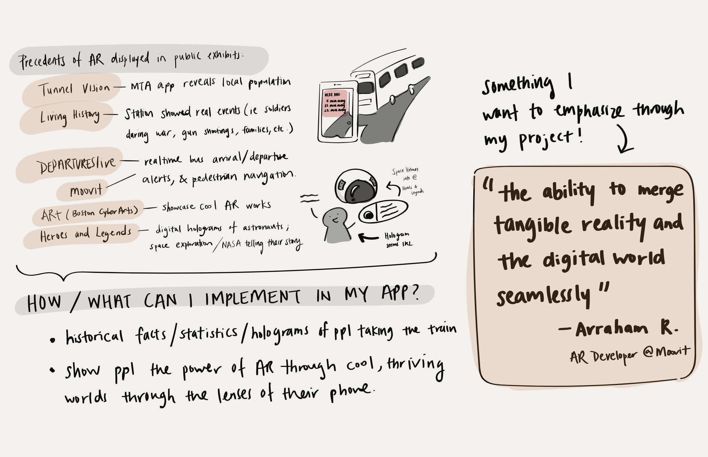
Sketching out existing apps using AR in train stations, along with abstrations and inspiration for my app.
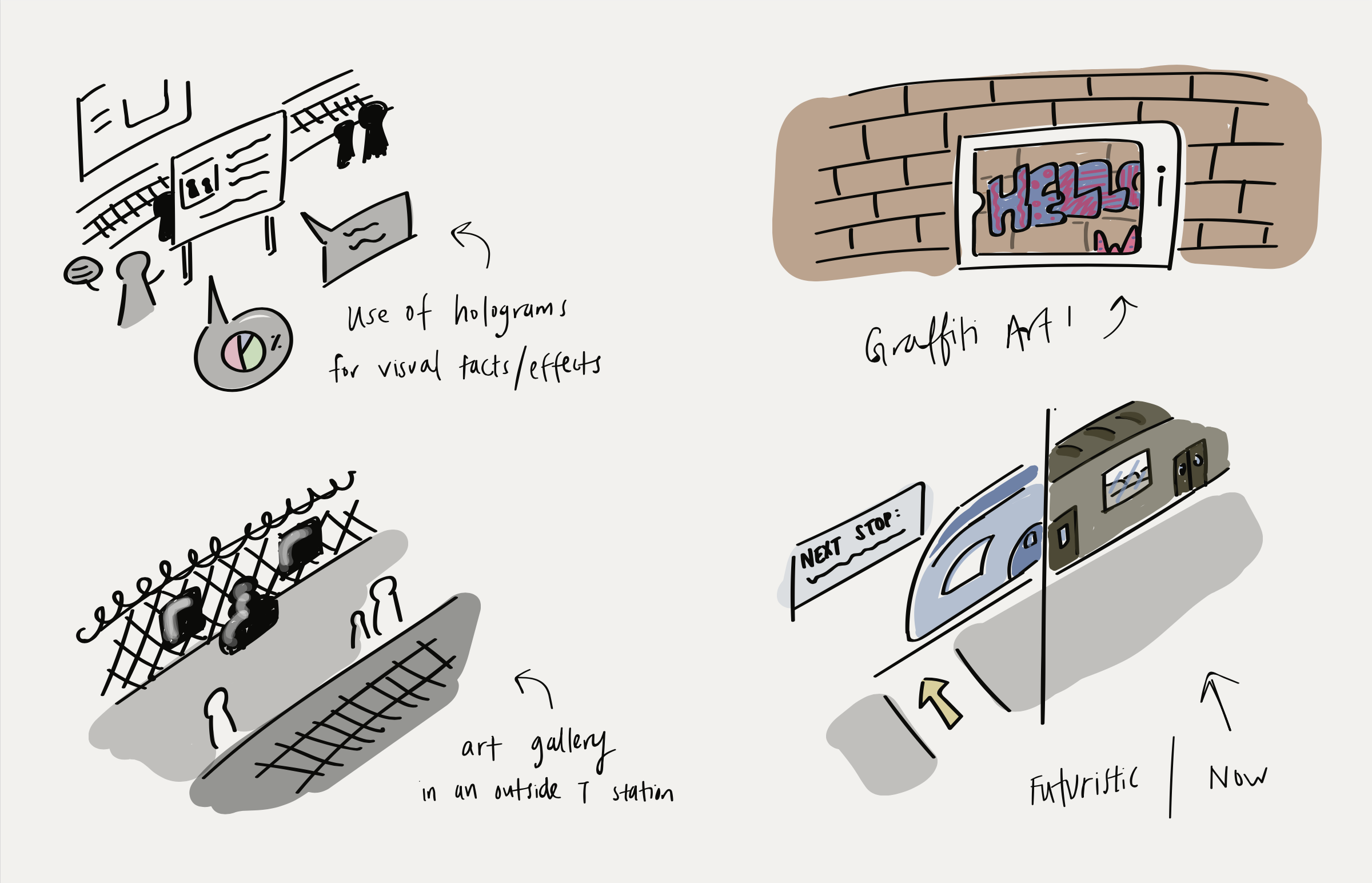
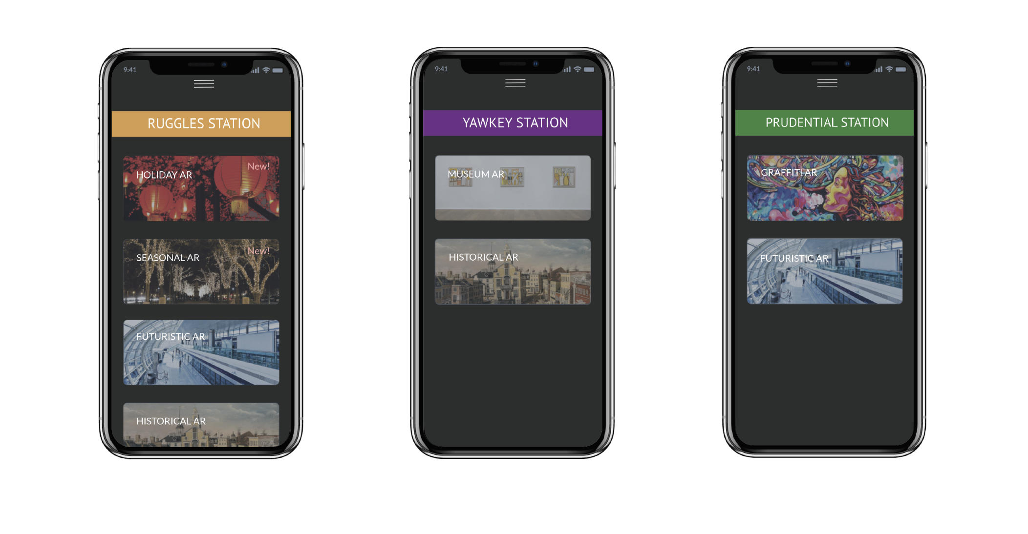
Examples of how AR in the MBTA would look like with different themes.
Final Takeaways
Concerns
Integrating modern forms of technology in the T stations will help specific audiences more than others: those who are technologically adept and those who are not.